Descriptive statistics are available for invited geofactors, height grids,voxel models and parameters (Parameter Manager/LocViewObject). For irregular voxel models and for parameters, data series with text can also be analysed.
¶ Deskriptive Statsitik für numerische Daten
You can view a histogram, the boxplot, a cumulative "curve" (0-1, normed cumulative frequency) or the QQ plot for the selected data series (usually accessible via the right-click context menu of the objects or in the ParameterManager).
The descriptive statistics of numerical data from raster data, such as geofactors and height raster, can be restricted to data within a selected polygon shape. This can also be done on a filtered shape. You can find out how to filter shape polygons in the linked article. Simply check Only for chosen Polygon and select the invited shape from the Dropdown list. The view updates immediately.
Below the graphic you will also see a small text field. It shows the coordinates of your mouse position in the graph field. It is intended to help you evaluate the graphs.
With the button Export statistics you can save the text for statistical evaluation in a simple text file.
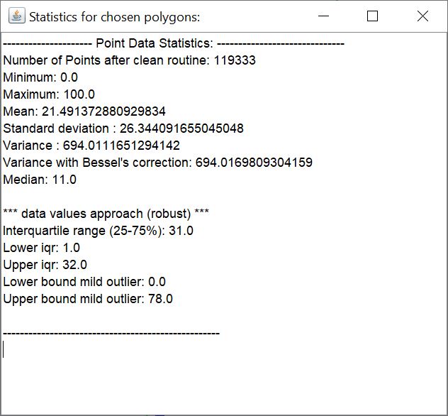 With the button *Statistics* you open a small text field with the statistical evaluation in a simple text.
¶ Histogram
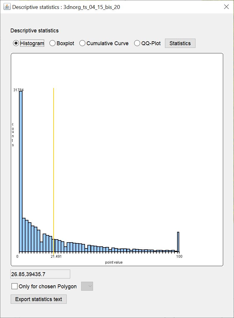
Under Histogram you can see a bar chart of the classified value ranges with the class division of the values on the x-axis and the number of values in a class on the y-axis. It can also be generously called a "histogram" because the class division covers the same interval at every point - so the class width is the same everywhere. Thus, the number of values in a class correlates with the relative number and can be plotted on y. The class division is calculated in a simplified way according to Scott.
The yellow vertical line marks the arithmetic mean. If the input values contain only integers and these only cover a spectrum of less than 15 different numbers, the class width is set to 1 because we assume that this could represent classified data. This is a conservative approach and may not fit the character of all data.
¶ Boxplot
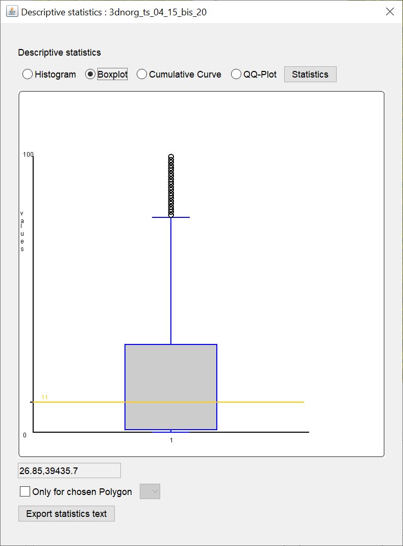
Here you can see the boxplot for the data. The yellow horizontal line marks the median value.
¶ Cumulative Curve
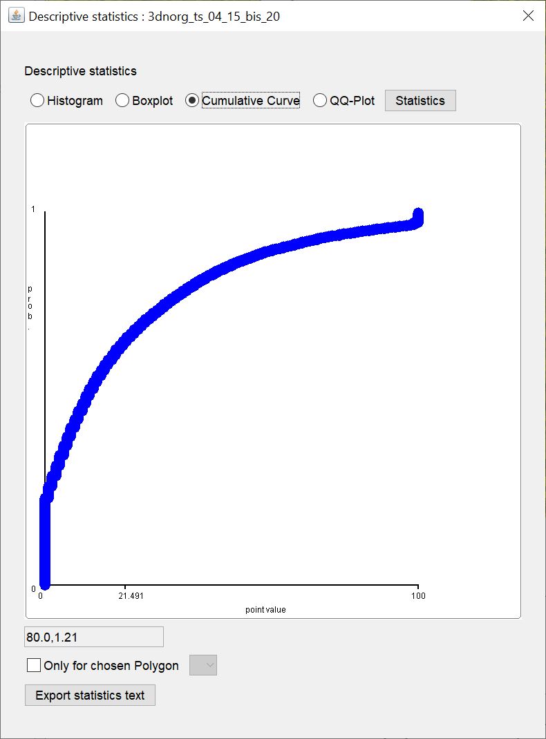
This plot does not actually represent a curve. Here you see the range of values on the x-axis and the quantiles (0-1, normed cumulative frequency) of a value plotted on the y-axis. The plot only shows the input values, but does not calculate a curve fit. When plotting a lot of data, the points appear together only as a curve.
¶ QQ-Plot
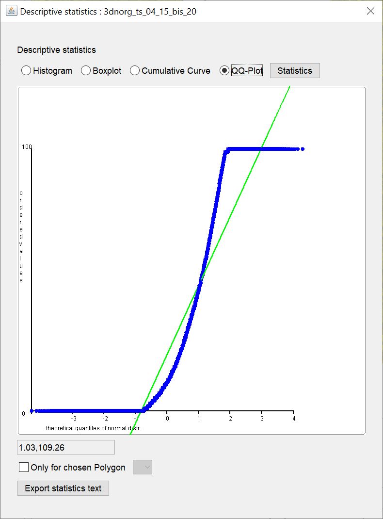
Under QQ-Plot the quantile-quantile plot is displayed. This is a simplified visual check of whether the distribution of your input values is close to a normal distribution. On the y-axis, the empirical quantiles are plotted against the theoretical quantiles of the standard normal distribution. The blue points thus correspond to the quantile pairs to the input values. The green line marks the ideal line if the empirical quantiles would actually match the theoretical quantiles exactly. So the further the blue dots deviate from the green line, the less a distribution also resembles the normal distribution. Note that the visual test cannot replace a statistical parametric test for normal distribution. However, in geology (unconsolidated sediments) we often have to deal with data that are not normally distributed and therefore an approximation can also be accepted depending on the questions in order to use more advanced methods, such as Kriging.
¶ Deskriptive Statsitik für Text-Daten
For the selected data series (usually accessible via the right-click context menu of an irregular voxel model or in the Parameter Manager), you can display a bar chart for the absolute number of occurrences of a keyword, and one for the percentage of all keywords in the category.
Below the graph you will also see a small text field. It shows the coordinates of your mouse position in the graph field. It should help you to evaluate the graphs.
With the button Export statistics text you save the text for counting keywords in a simple text file.
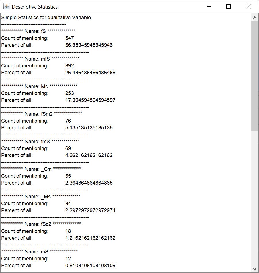 With the button *Statistics* you open a small text field with the statistical evaluation in a simple text.
By the way: If you send text data series from the parser for shift descriptions or comparable text formats into the statistics, a string splitting takes place in order to be able to treat the keywords listed in a series individually in the count. Please read the linked article for more information.
¶ Frequency
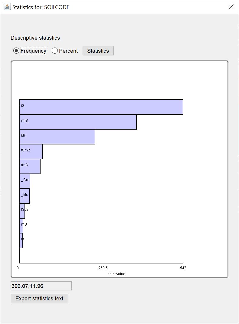
You see a horizontal bar chart with the absolute number of a certain keyword from a text data series. Only the first 10 keywords with the highest number are shown. All others can be viewed in the text with the button Statistics.
¶ Percent
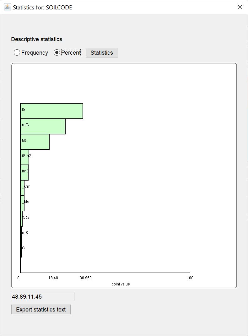
You see a horizontal bar chart with the percentage of occurrence of a certain keyword from a text data series. Only the first 10 keywords with the highest percentage are shown. All others can be viewed in the text with the button Statistics.